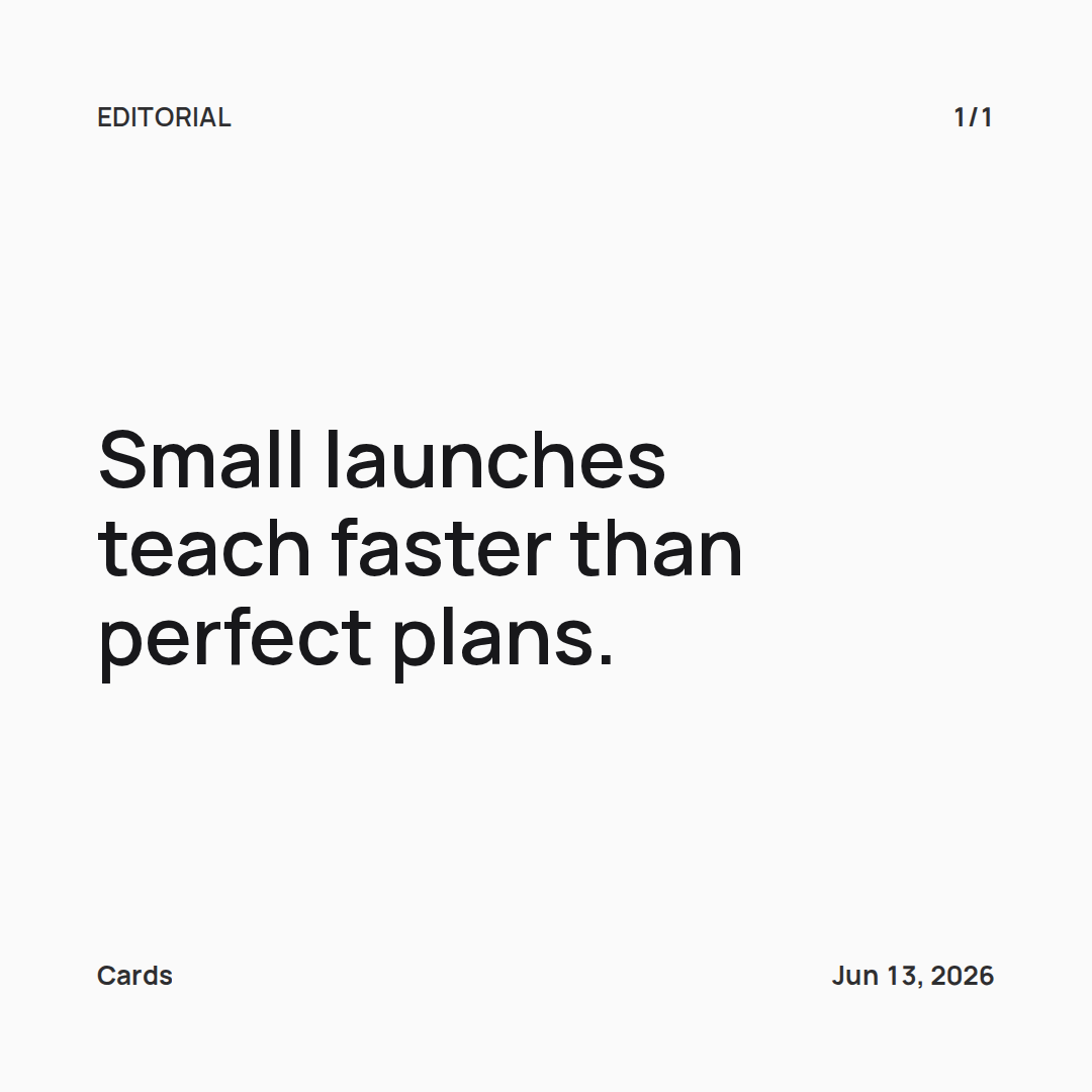
Minimal quote card
A quiet black and white square card for quotes, notes, and carousel openers.
quotesminimalinstagram
Cards gallery
Browse examples for quotes, launches, carousel openers, notes, and social posts. Every style here is free to open and export, including text gradients, backdrops, styled headings, text shadows, and photo backgrounds.
Every card here started as plain text. You paste a quote, a caption, or a longer draft, and Cards lays it out across slides at the size each platform expects. The examples cover common uses: a single quote card, a multi-slide carousel, a launch announcement, or a short note. Pick a style as a starting point, open it in the editor, and replace the words with your own. The export is a PNG set, so what you see in the preview is what you post.
These use the editor and export without an account. They cover the everyday posts: a clean quote, a carousel opener, a founder note, a data update, text over a photo. Open any one, swap in your text, and export a PNG set.
A quiet black and white square card for quotes, notes, and carousel openers.
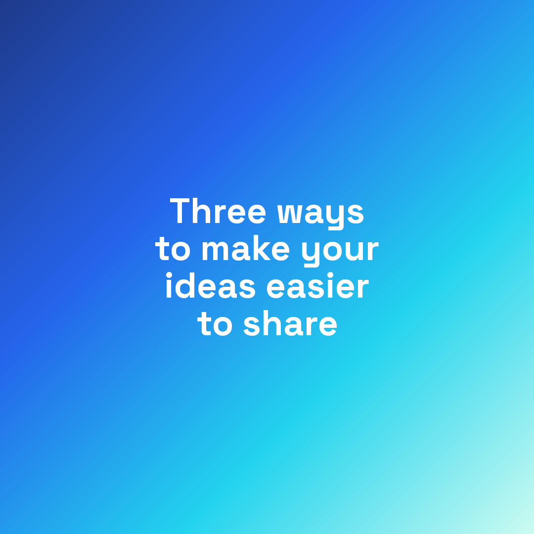
A bold gradient card for announcing a thread, lesson, or short carousel.
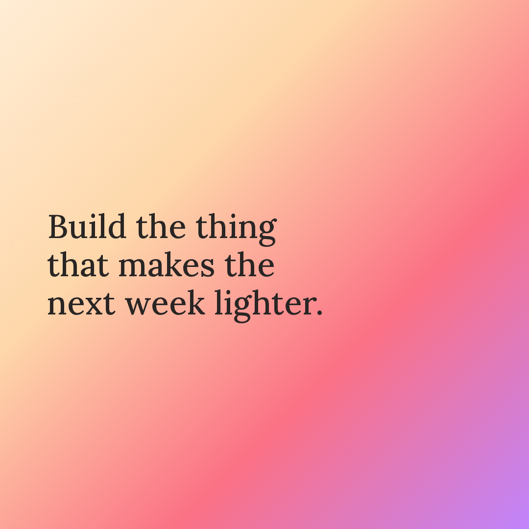
A soft editorial card for founder updates, product notes, and calm announcements.

A high-contrast card for sharp one-liners, section breaks, and bold statements.
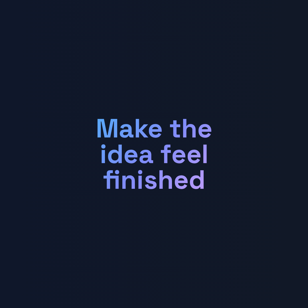
Gradient-filled text for a large visual headline.
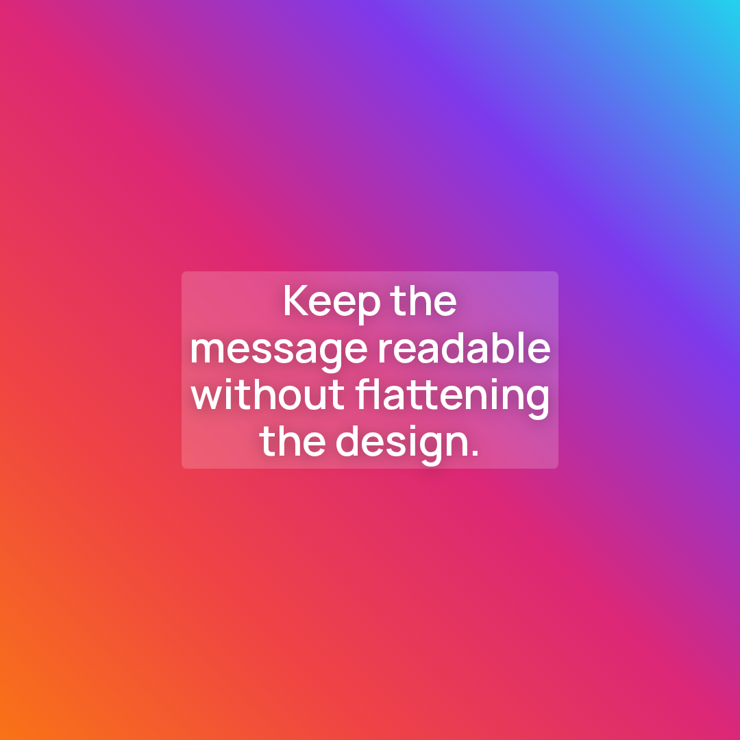
Keeps text readable over lively color and image-heavy backgrounds.
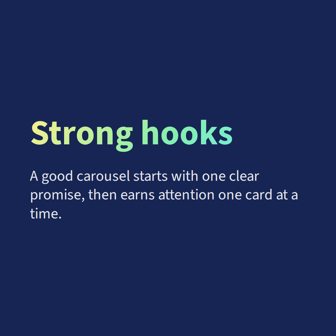
Separate heading styling for structured carousel slides.
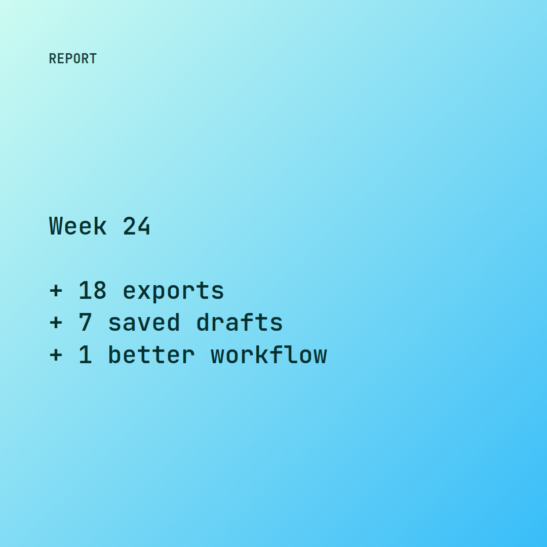
A compact technical card for product metrics, build notes, and changelog snippets.

A text shadow keeps the headline readable on bright campaign posts.
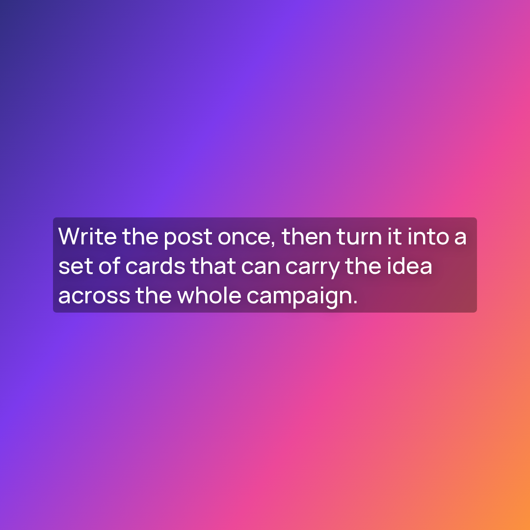
A translucent text panel for longer copy on rich backgrounds.
A highlight card for one standout slide while the rest of a carousel keeps the base system.
A quote card with serif typography, an author footer, and reusable editorial styling.
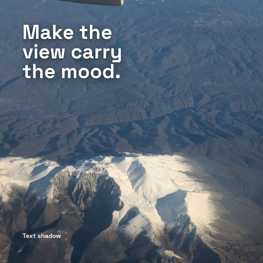
A text shadow keeps a short headline readable on a real photo.
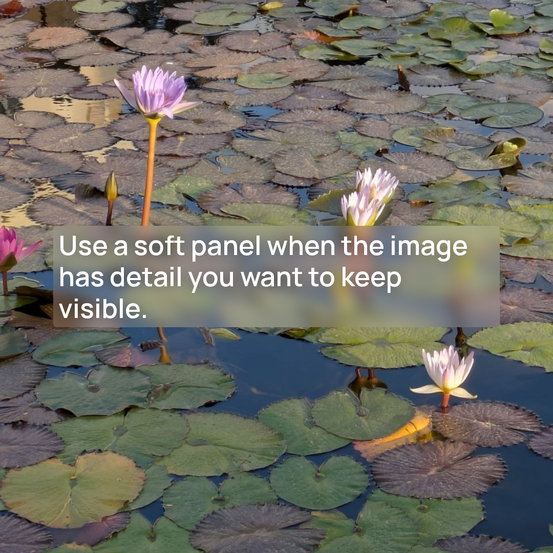
A frosted text backdrop keeps copy readable on detailed imagery.
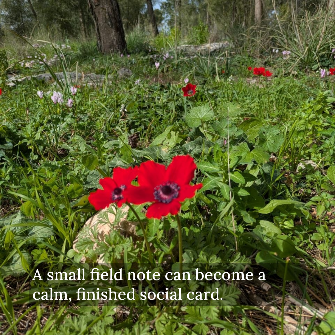
A real photo, a compact editorial header, and a translucent text panel.
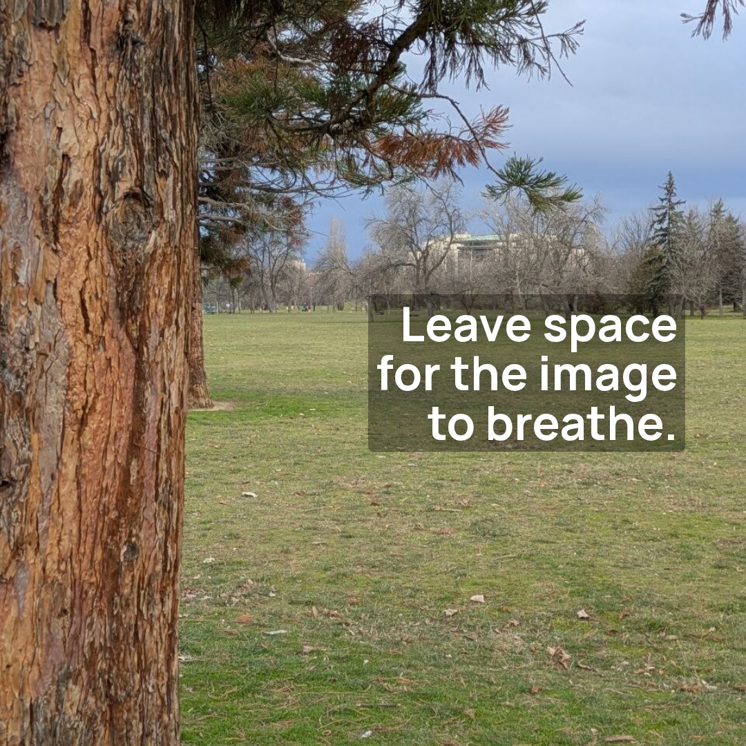
Right-aligned copy placed in the open space of a quiet park photo.
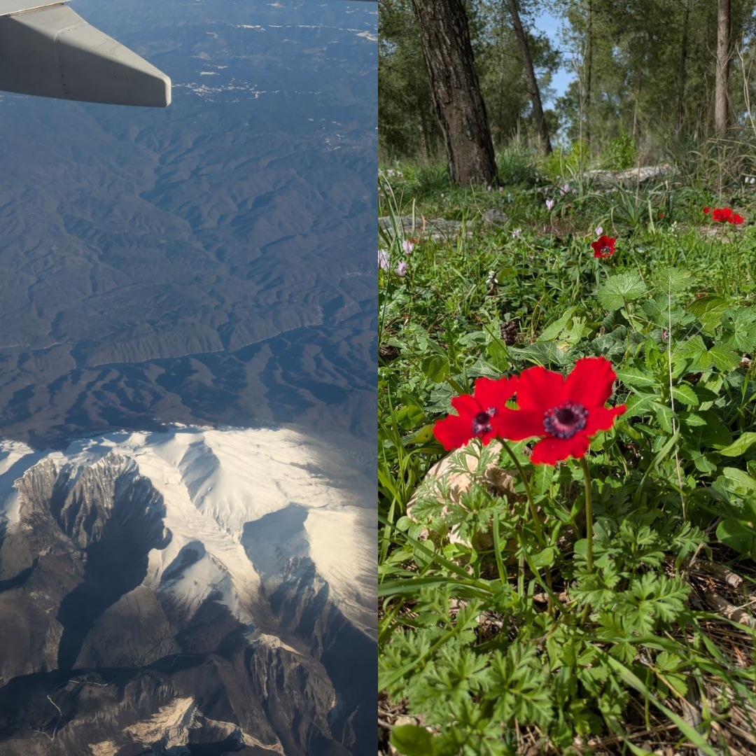
Two photos side by side with the border set to zero, so they meet edge to edge with no seam.
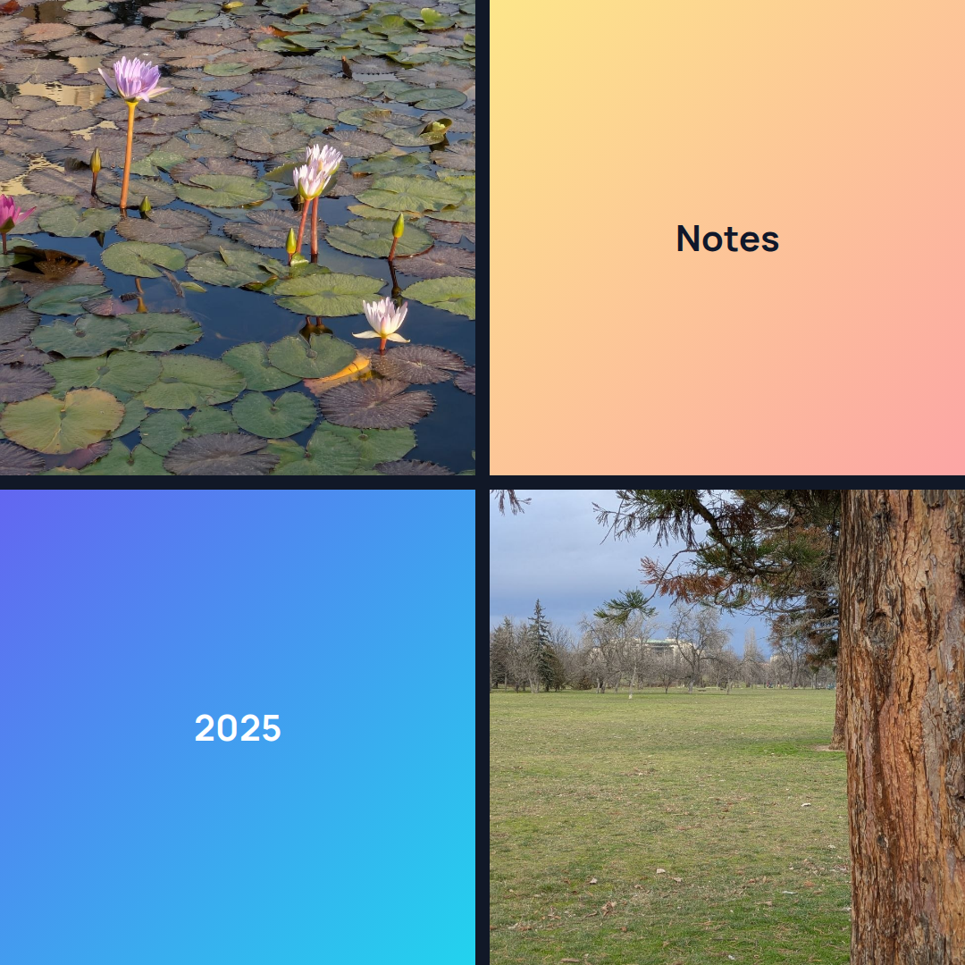
A four-card grid mixing photos with short text. Thin dark borders keep the tiles distinct.
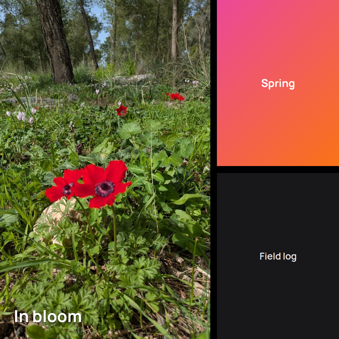
One large photo beside two stacked panels, the feature layout for a lead image with captions.
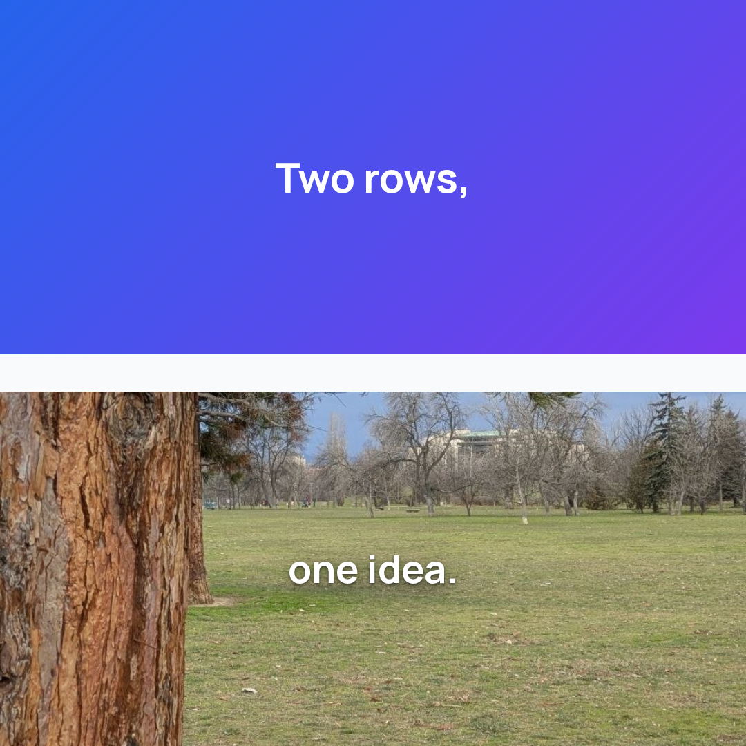
A headline over a photo, split into two rows with a wide border you can widen or narrow.
Premium collage layouts are a Cards Pro feature: diagonal, diamond, chevron, wave, and arch templates that arrange several cards into one shaped composition. The base grid collages stay free. The last three tiles play instead of sitting still, because Pro also renders a deck as a video: gradients, photo backdrops, and a collage slide all animate.
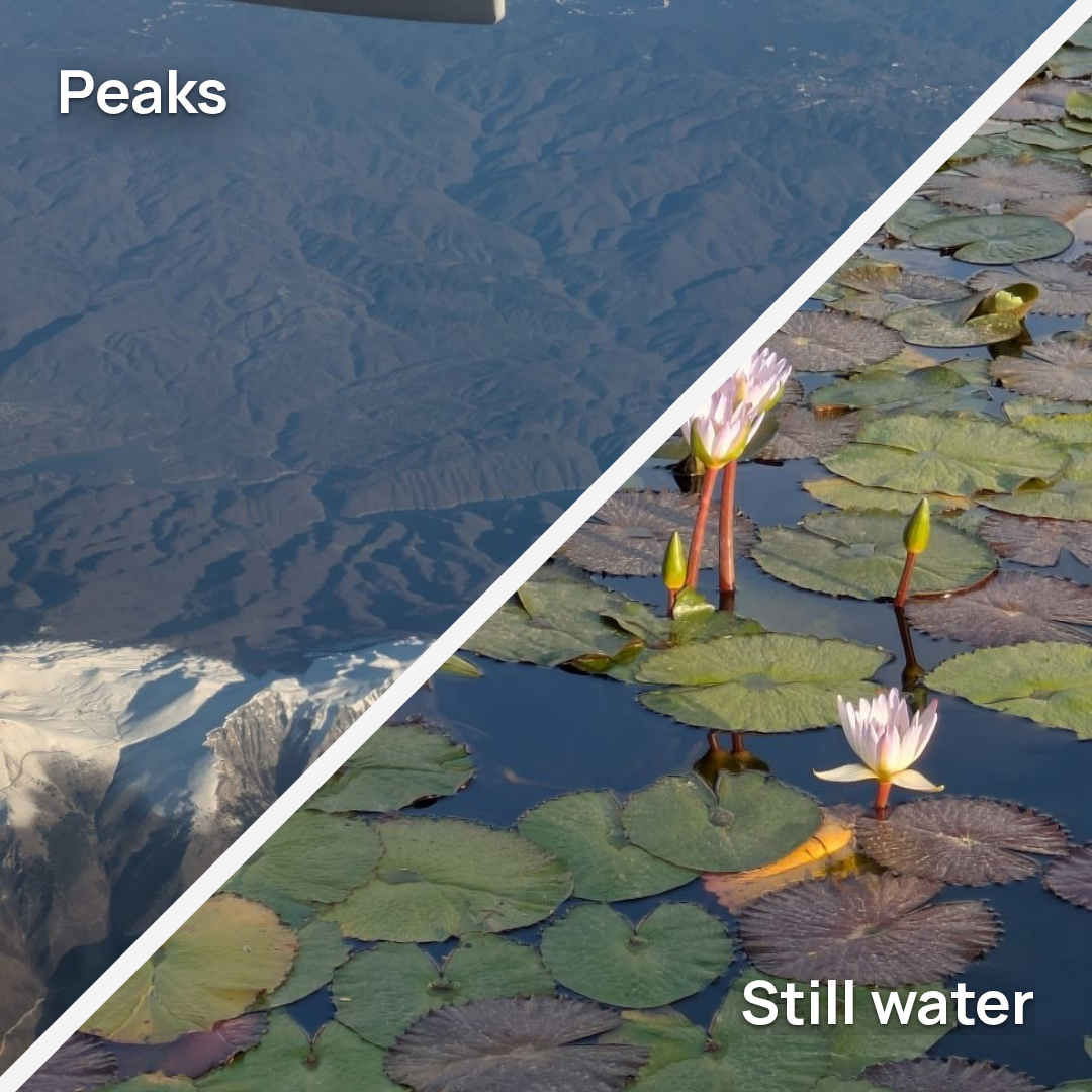
Two photos meet on a diagonal. A Pro collage layout for a before and after, or a two-mood opener.
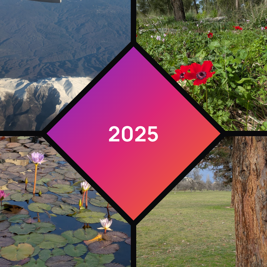
Four photos around a highlighted center panel, the diamond Pro layout for a recap or a set.
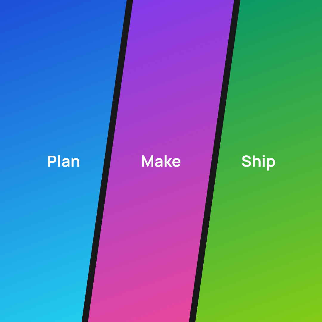
Three gradient panels split by a slant, the chevron Pro layout for a short sequence.
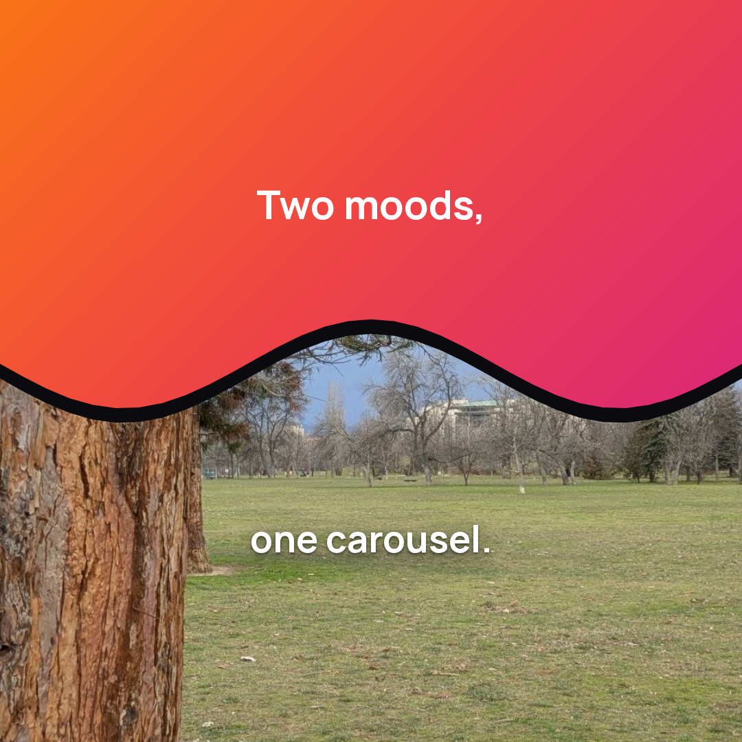
A gradient and a photo divided by a soft wave, the wave Pro layout for a two-part idea.
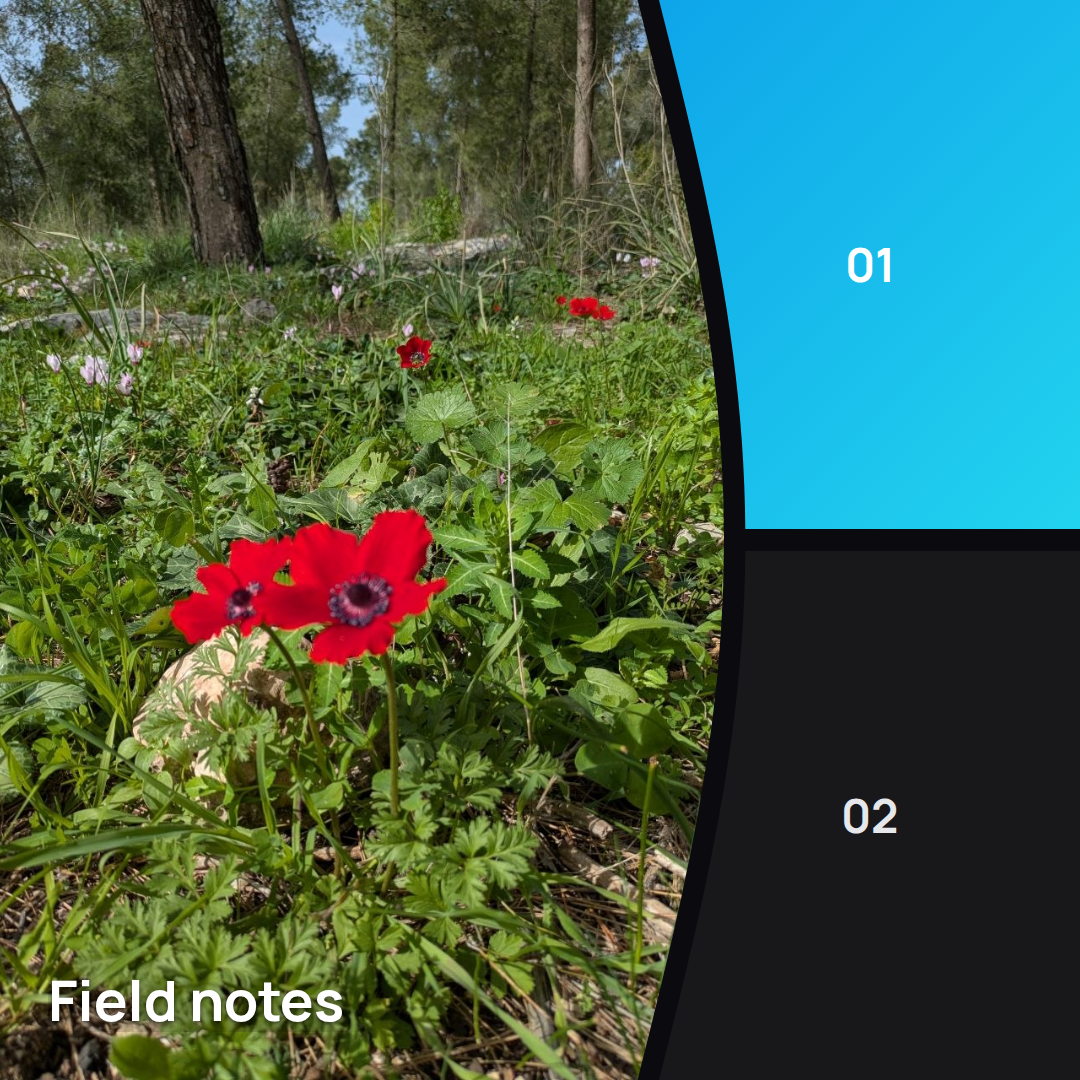
A large photo with an arched divider and two stacked panels, the arch Pro layout for an editorial set.
A refracted light plane opens across the frame. Photo backdrops animate like gradients.
Color-washed tiles assemble the card. A collage slide travels as one card.
Cards arc through depth with an off-axis turn, then the copy resolves line by line.
Twelve presets ship in the editor, and the preview plays for free. How the video render works.